Wake Me Up Before You Logo
Now that I’ve given you an earworm, continue bopping as I tell you about something important you need to consider for your brand: logo variations.
When I sit down with my clients to discuss their logo, I can sense their excitement. This is the one design element to which they can lend the most amount of their ideas. I love hearing what they have in mind, and figuring out how their personal and business values reflect into a visual form. Of course, I base the logo on the target audience and strategy, but I love adding the touch of the business owner into the final logo, if it’s possible.
As a budding business owner, you have a clear idea of this one crowning design element that represents your business. What you don’t expect however, is using this same logo in different variations, at the same time.
What are logo variations?
As the name suggests, logo variations are different design formats of your logo.
I can picture you now, you’ve just read that previous sentence and thought, ‘But doesn’t my logo have to be consistent wherever it appears?’
Logo variations do just this without sacrificing on quality, even though it isn’t the exact same version of the logo. Sounds counter-intuitive? Stay with me.
Now imagine you have only one version of your logo, and it’s uploaded on your business’ Instagram handle. It looks so tiny, and is barely readable. So you need another version of the same logo, which is optimized for Instagram’s tiny circular profile photo.
You can’t use the same layout of your logo on every visual and print asset. It has to be changed to suit the medium and the space. Hence, you need variations of the same logo.
What are the logo variations you need?
PRIMARY LOGO:
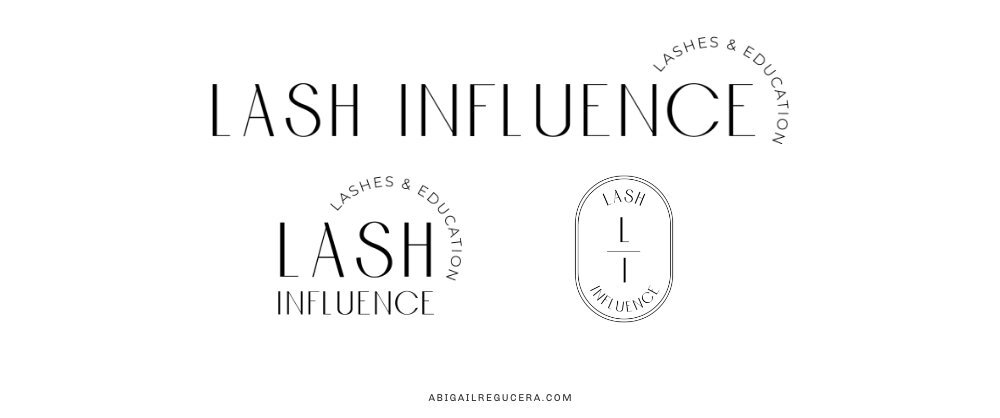
This is the standard logo that represents your business. Most often, the business name, icons, brand colours and tagline make up this logo. All the other variations of the logo will take inspiration from this primary logo. It can be used anywhere it fits, and is the umbrella image of your business.
SECONDARY LOGO:
The secondary logo, or alternate logo, is a simplified version of the primary logo. It allows you to stay true to the primary logo, but is more flexible. Oftentimes, it’s the opposite orientation of your primary logo. So if your primary logo is horizontal, this is the stacked version of the logo, to display in vertical forms. It comes in handy when you need to display your logo in a compact space, such as a business card or mobile banner.
SUBMARKS:
This is the simplest version of your logo, it can be just initials of the business name, or an icon that can stand alone as an identifier (note that icons are another logo variation). And there we have it, the image you can now use for your Instagram handle.
ICONS:
It is simply an icon that can be presented on its own. While icons can work as a submark, not all submarks consist of just icons. This icon appears as a stand-in for your logo, where it wouldn’t fit, and is immediately linked with the brand. Think of the Nike swoosh.
I’ve touched upon design scalability in my blog, and logo variations are the perfect example of brand keeping up with your business.
As a new entrepreneur, you think you need only one or two versions of your logo, because you require only business cards or an Instagram profile at this early stage. Over time, your business expands, you now have the resources (and need) for a website, and other new products/services. All these elements can carry your logo. But if you have only one or two versions designed, you’re making it fit into limited pixels and small places. As a result, you lose out on visibility. This is why logo variations uphold the quality of your brand, and at the same time, ensure uniformity.
When you’re going through the grind to establish your business, logo variations hint at something you’re moving towards—business growth. Whether you’ve used them or are going to, every logo variation is a reminder that you have (or will have) another asset to put your logo on. And I hope you give yourself a pat on the back for it!


